People often ask me how my paintings take shape. The following is from an e-newsletter article on Painters Online that I wrote, giving a step by step process for my painting Towards Southend.
Some of my paintings do it for me and some just don’t! I paint landscapes, seascapes and architectural subjects in the main, but they don’t all mean the same to me.
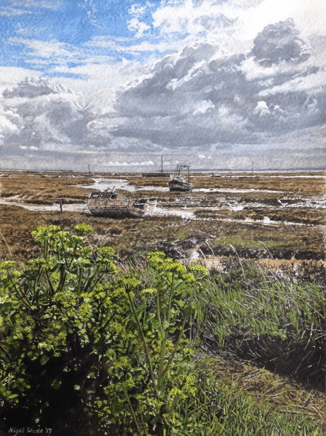
My favourite ones, the ones I would hang on the wall at home, have to have a meaning as well as depicting an image that I actually like. This painting, “Towards Southend” is very significant to me and actually does hang on my living room wall.
Composition of the image is key in the first instance, so on our trips out my wife and I are often snapping away on the camera, both always at pains to avoid what we call “chocolate box images”. I can’t say I always manage this but I don’t think I paint any of these any more – not if I can help it anyway. I need lots of reference photos because I paint lots of detail, which is highly accurate to the scene itself, mainly because this is what I like doing and also because the people who buy my paintings want this accuracy.
It is a subject I wrestle with though, or rather that I used to wrestle with, because I’ve accepted it now, but people either admire realism/ hyperrealism/ photo-realism as a genre or they can’t see the point of it. Well if it was good enough for John Ruskin, it’s good enough for me and Ruskin’s Pre-Raphaelite principles were that the artist “rejects nothing and selects nothing.” Anyway, I’ve tried to loosen my style up from time to time and it doesn’t seem to work for me; I’m just not very good at it, so I will leave it to those who are!
Back to the subject of this painting, Towards Southend. It was the second time I had painted this view, using the same reference photos but from a fractionally different angle this time and I was commissioned to do it after a friend saw Version One. Here are both images, as you can see they are very similar, each with a slightly different light.
We ended up on the sea front at Leigh on Sea on an April day in 2016 after arranging my best mate Paul’s funeral – just had to clear the head – when the sun came out and the sky became very dramatic and almost heavenly.
I immediately took a few photos and I just knew I was going to paint this view which was looking towards Southend, with the mile-long pier in the very distance. I didn’t realise then that I’d paint it twice.
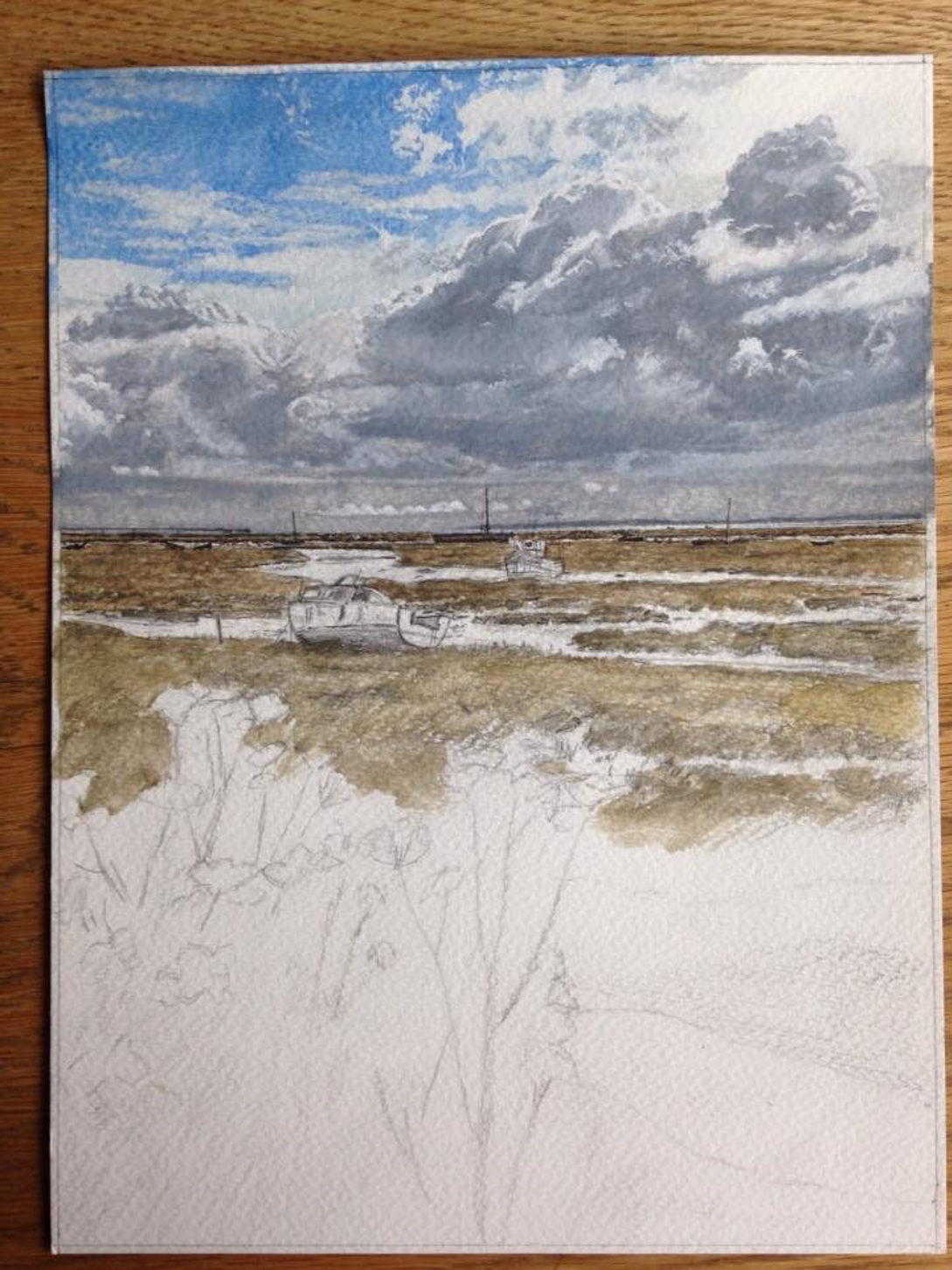
Stages 1-3
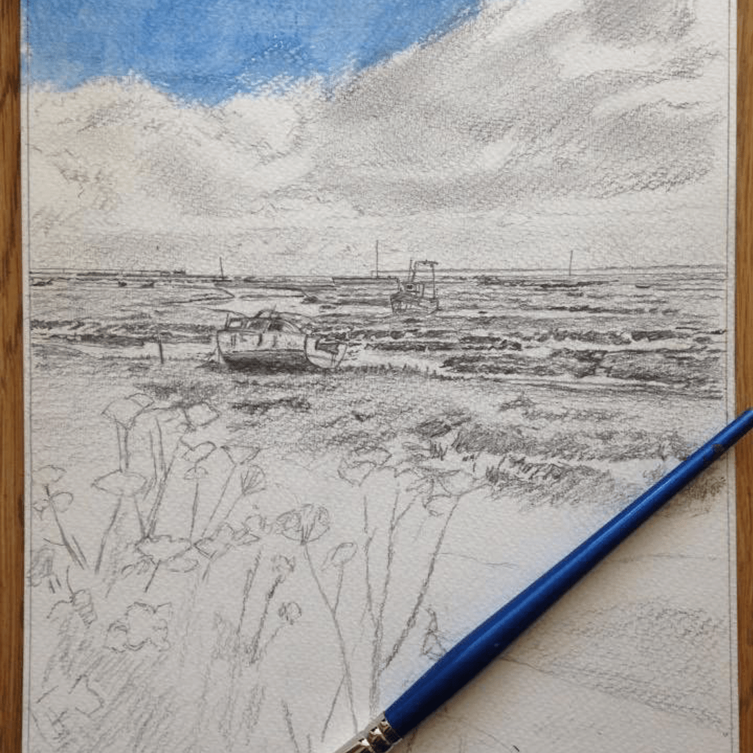
I’d decided the painting was going to be A4 size, to fit the space I intended it for, although I prefer painting A2 or A3 size these days. That moment when you’re good to go, pencils and paints at the ready with a blank sheet of watercolour paper staring up at you is always daunting and I always start slowly, doing an initial drawing.
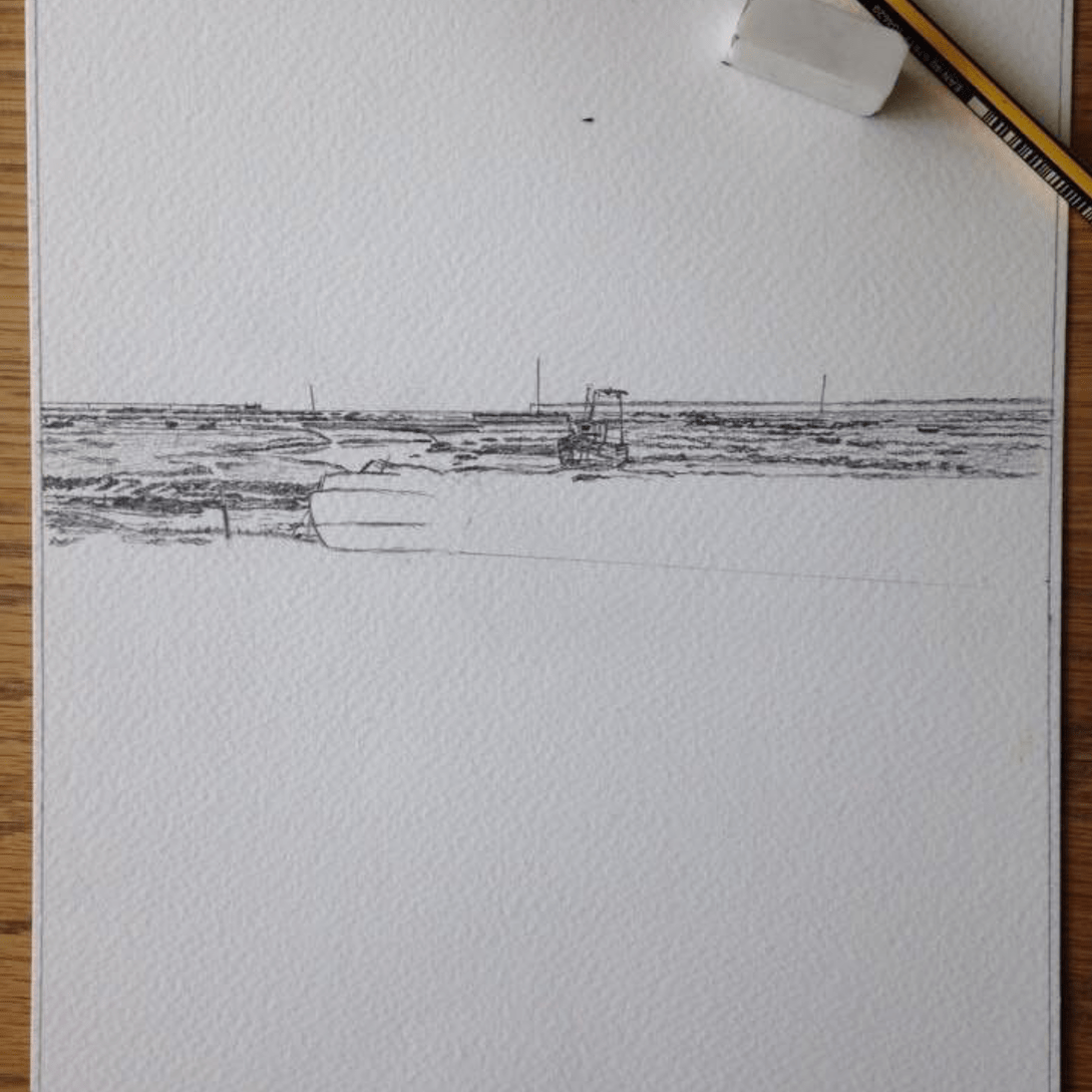
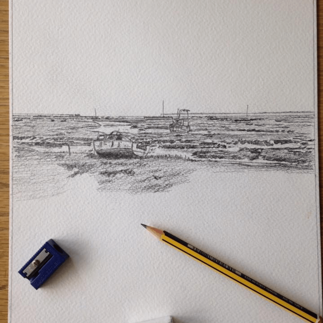
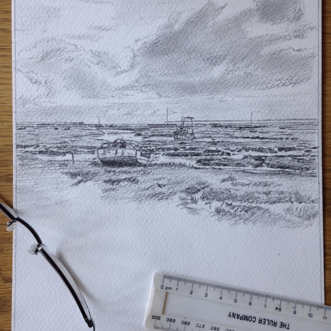
The first few images in this step by step show the drawing stage, I did the distance and middle distance first and a rough representation of the clouds.
To get the overall dimensions and perspective right I tend to measure a fair bit and after a while I get fed up with that and decide to do a rough outline of the foreground and then I can’t wait to start painting the sky.
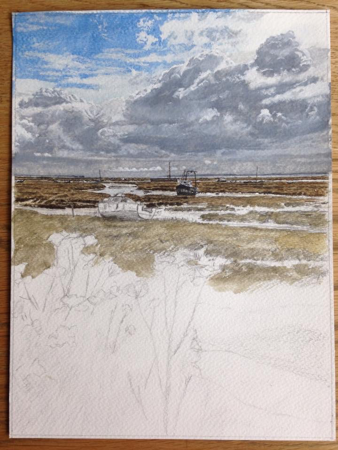
Stages 4-7
I really love the freedom of painting skies – probably because the rest of the painting is going to be quite tight. For the sky I use ultramarine and ceruleum blue, together with Chinese white.
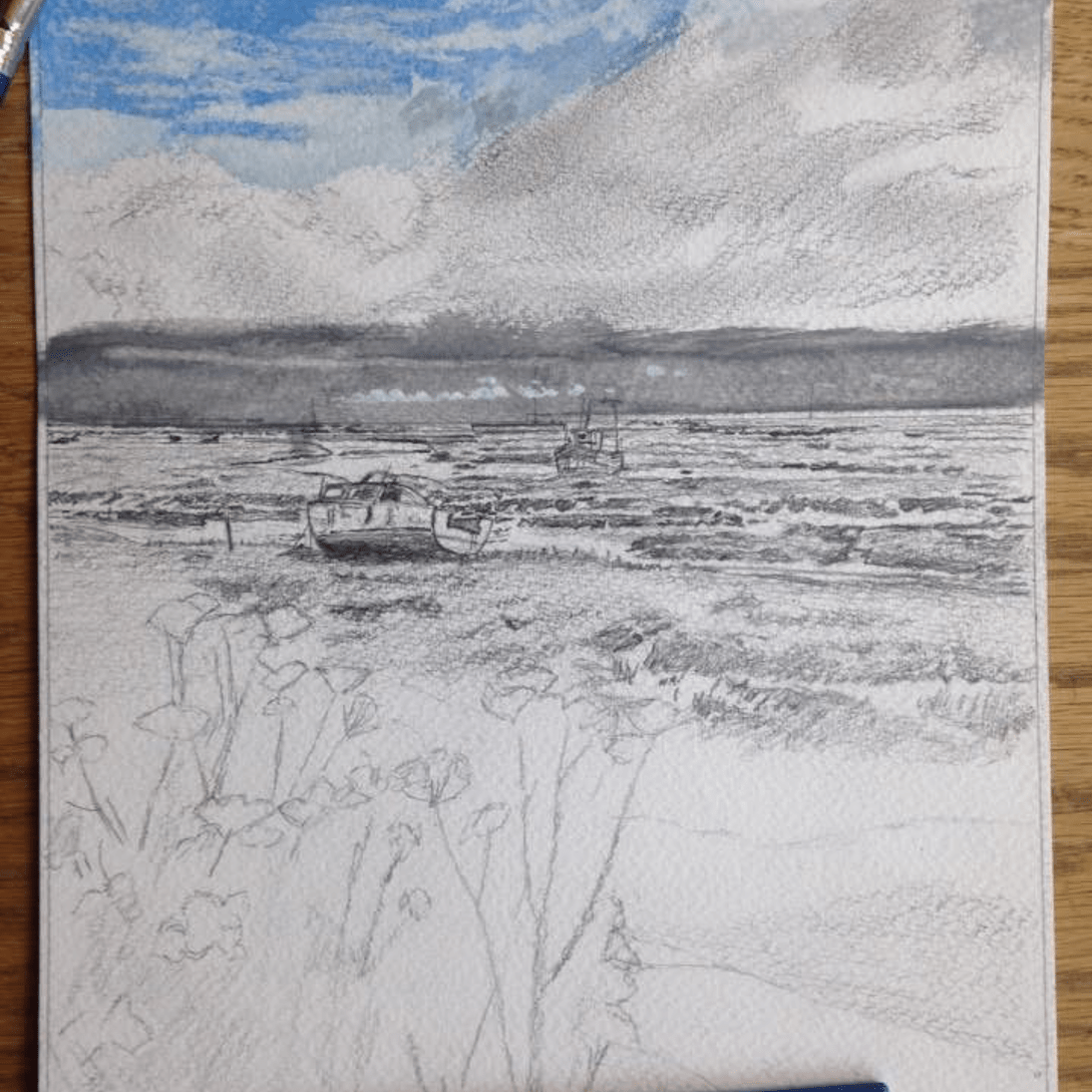
That splash of blue on the paper always looks too blue at first, but I hold my nerve because I’m then onto the clouds which I know will contrast with it nicely. I have ivory black, Chinese white, titanium white and a bit of ultramarine blue on my palette and off I go, doing an area at a time and redoing it until I’m happy with the effect. It’s quite a dramatic sky – just what I like painting.
Stages 8-12
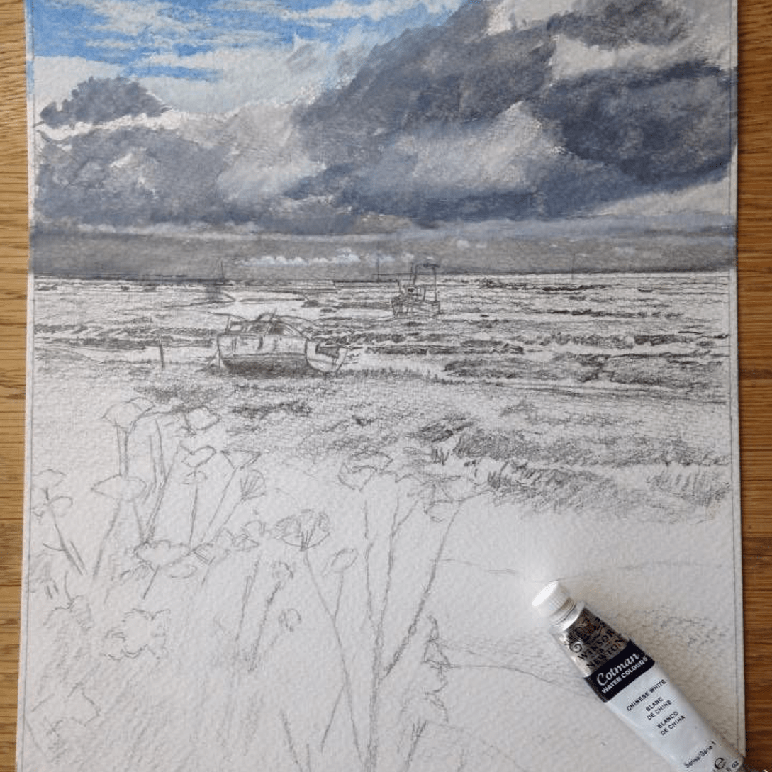
The distance and middle distance was challenging, as there’s a lot of detail in the boats, the channels of water and the vegetation.
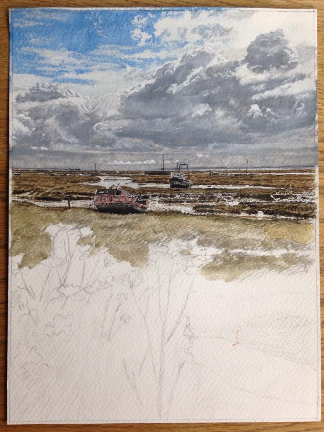
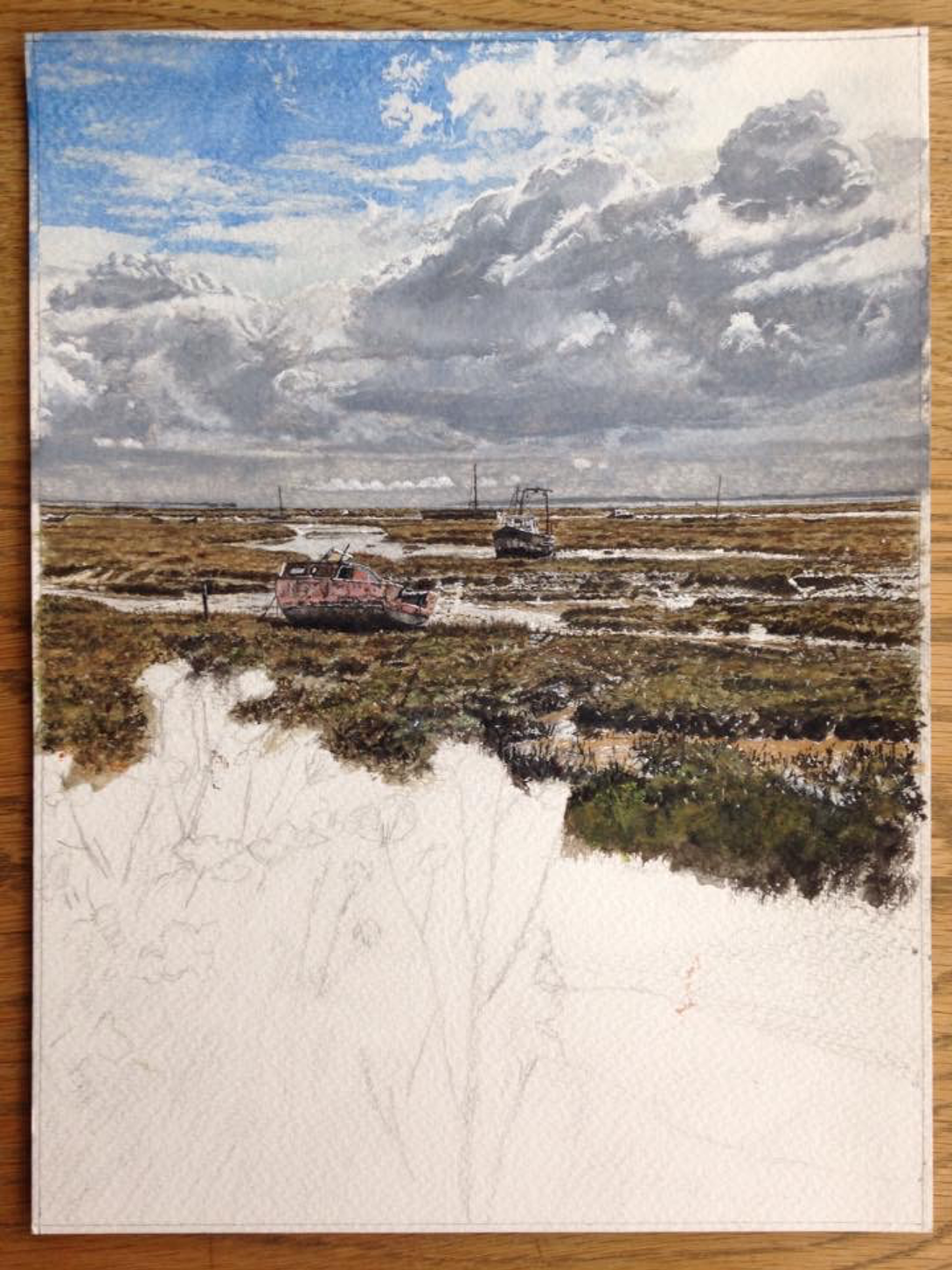
Yellow ochre, sap green, ivory black and Chinese white were the main colours I used here, some of the channels of water were left as blank paper and I enjoyed getting the muddy water effect.
The boats were fun to do, especially the rusting, marooned pink one, but it’s the muddy water that I enjoyed most.
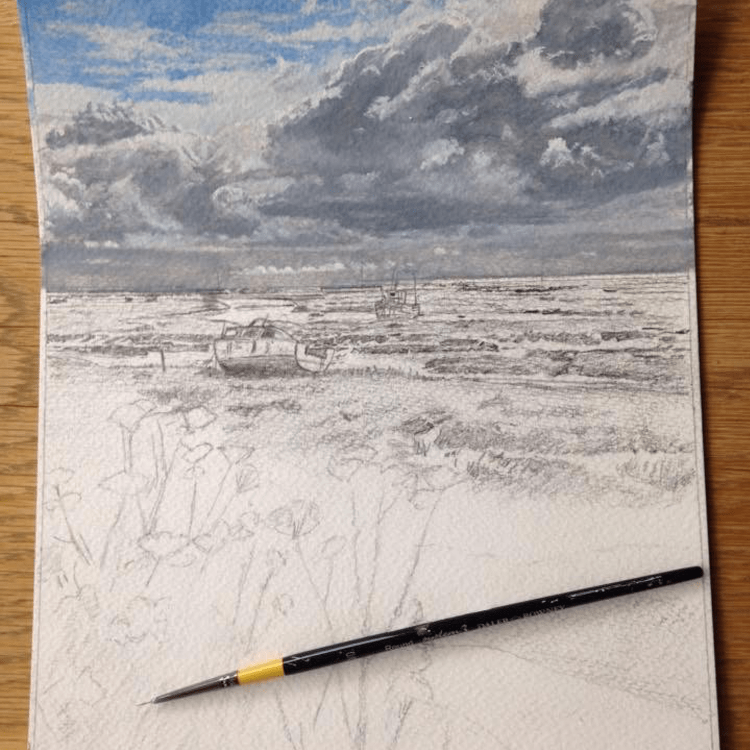
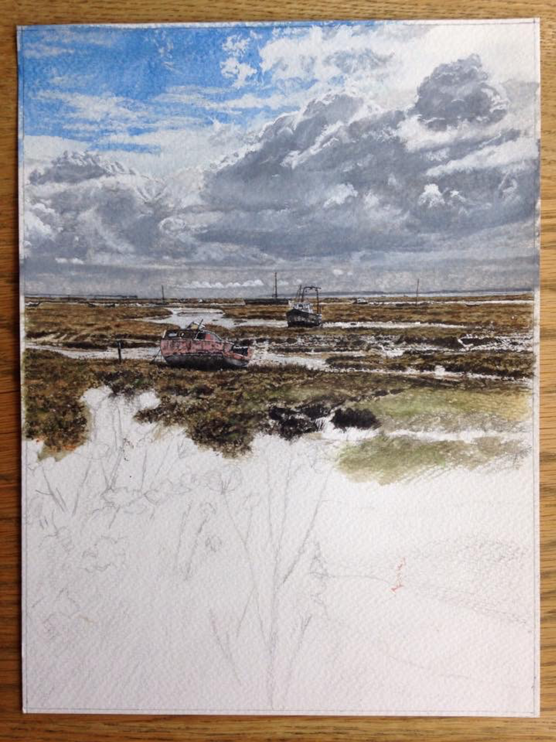
Stages 13-15
I can’t say I was looking forward to doing that foreground that much as I knew I would be investing a lot of time painting what most people would think of as weeds in very fine detail.
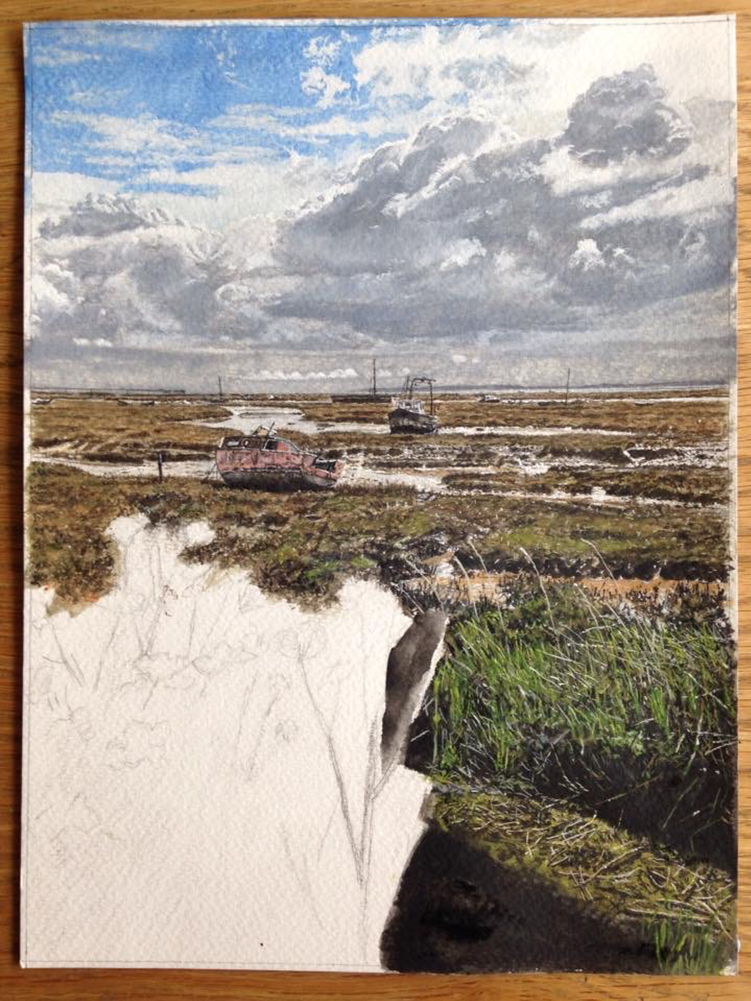
I tend to paint a black wash first for this kind of vegetation and then paint light over dark – not the traditional way with watercolour – but it works for me to get the intense shadows.
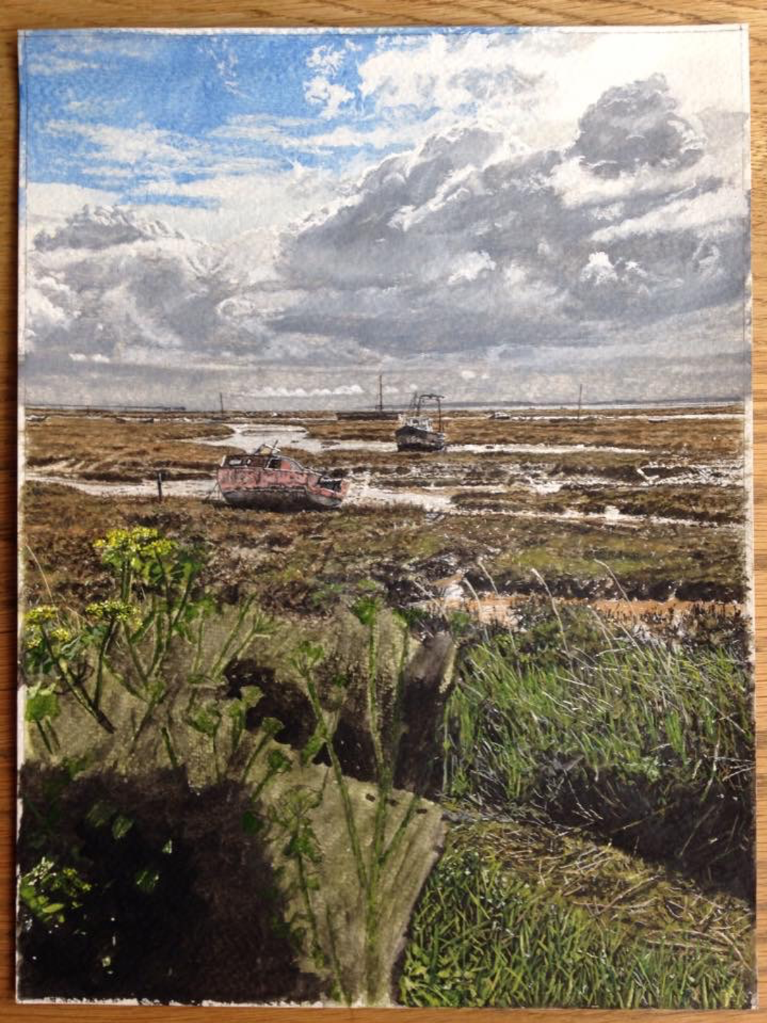
I then paint the plants in very undiluted mixtures of paint, sometimes completely neat to get the intense colours. Sap green, emerald green, leaf green lemon yellow hue, cadmium yellow, yellow ochre, ivory black, Chinese white were on my palette for this phase of the painting and yes, it did take quite a bit of time.
The intense yellow of the flowers in the sunshine showed that even weeds can look good. 48 hours later, all done, signed and off to the framers; this is the part of the journey I like best, but I’m already looking forward to starting the next one within a day.
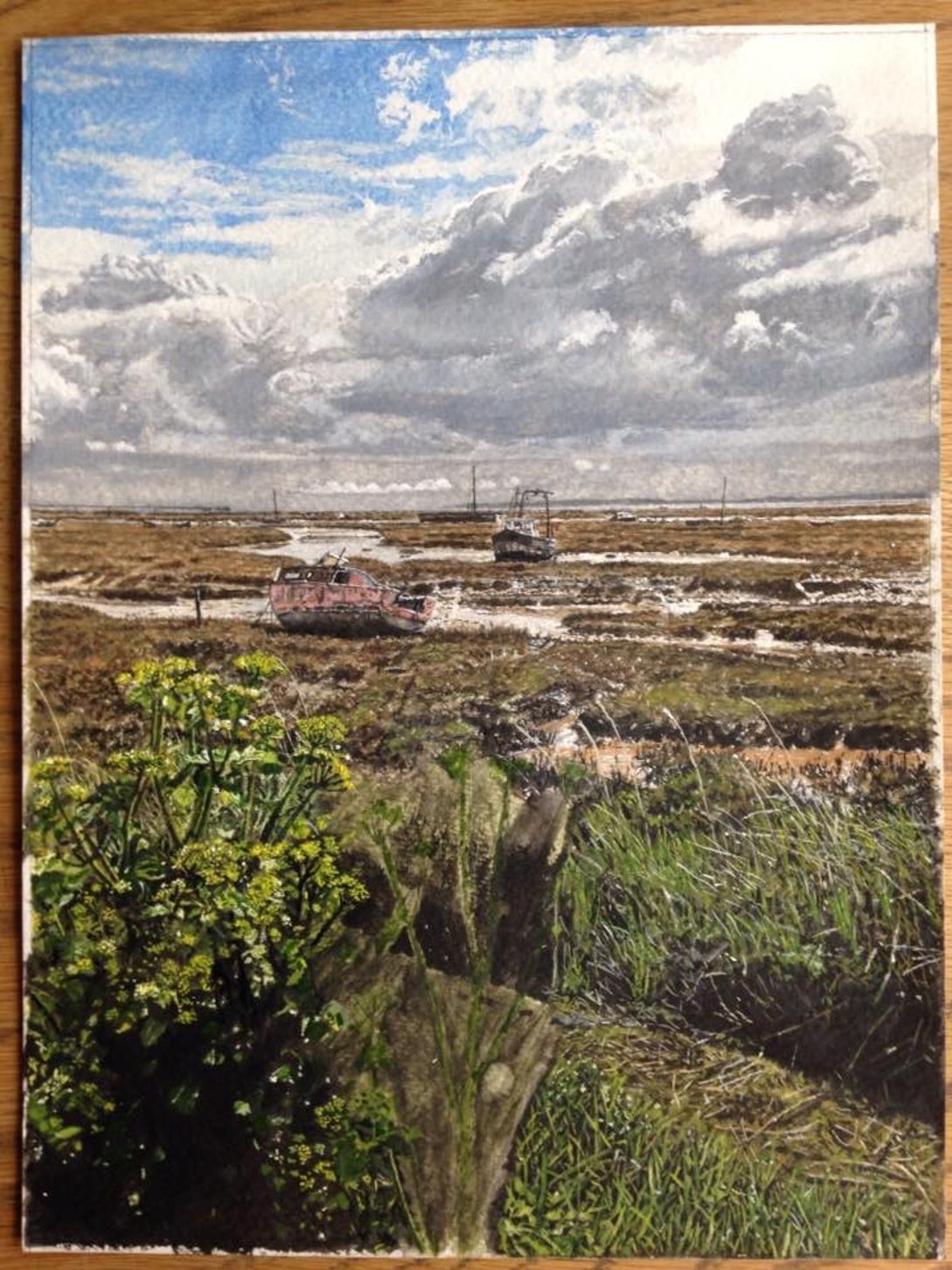
And here it is, the Finished Painting!


Leave a comment